This Enfocus PitStop command allows us to select objects that appear to be in black and white, even though they have another colour mode. In the case of images, these are usually pictures originally in black and white or with a slight toning or shade. They can also be images that are almost monochrome but with a few colour details.
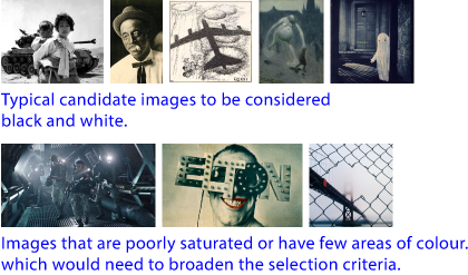
Warning: "Chromatically neutral" is not the same as "monochromatic". A monochromatic object is made up of different levels of intensity of the same shade of colour (e.g. red, green or black).
For an object to be chromatically neutral, its colours must have a very similar amount of all its colorants, so that its appearance is made out of grey tones.
In other words: All neutral objects are monochromatic but not all monochromatic objects are neutral. So this command will convert a monochrome image of dull tones but not one of vivid tones, for example.
What does this order assess?
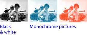
This order evaluates two criteria, which are not mutually exclusive: The colour appearance (whether it is more colourful or less colourful) and whether it has more or less colourful areas. Anything that falls below a limit set by the user will be considered black and white.
Warning: When assessing whether an object is more or less "colourful", it does not consider the final visual appearance. The original value of the colorants prevails.
Very colourful objects with their visual appearance changed by other objects are judged by themselves. Not by their final visual appearance. In any case, the object responsible for the colour change (if applicable) is selected.
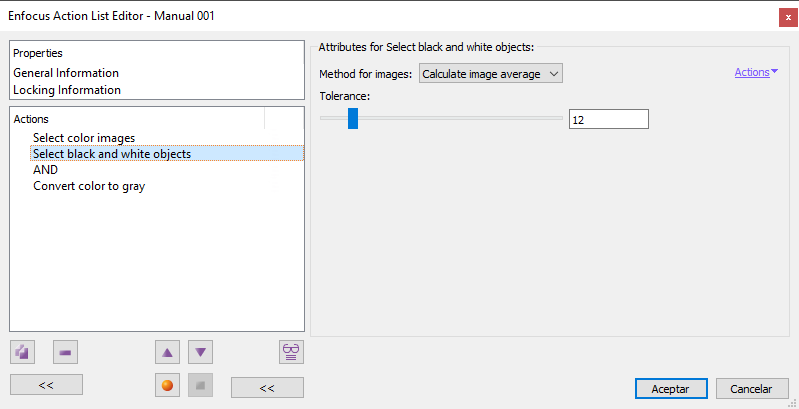
Tolerance
This value, that goes from "0" to "100", tells PitStop the threshold to consider something to be black and white: "0" is the minimum (it only selects what is black and white: exactly the same amount of colorants) and "100" is the maximum (everything will be considered black and white, no exceptions).
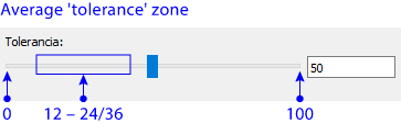
For text and vector objects, values for reasonable results range usually between "12" and "24" (depending on the characteristics of the particular job). For images, values between "16" and "36" usually work best.
This parameter is the main one and affects all types of objects (vector, texts and pixel images).
Warning: Bluish objects of all types tend to require slightly lower values than other hues.
Method for pictures
As the name suggests, this criterion only applies to pixel objects (although at high values it seems to affect other objects). It has two possibilities: "Calculate image average" and "Look for colored areas". In both cases, their effect is determined by the set "Tolerance".
Warning: Images seem in general to need higher values than vectors and texts. So, in some cases, we may want to select only images or only vectors and texts and apply different values to each set.
Moreover, in theory these two options do not affect vector objects. But, in fact, the vector or text colour values at the selection threshold limits may vary depending on the chosen option.
Calculate image average
This method allows us to select images depending on whether they are more or less colourful in general. It is the most usual.
Iy averages the colour values of all pixels and checks if this average falls below the tolerance threshold (in which case the picture is selected).
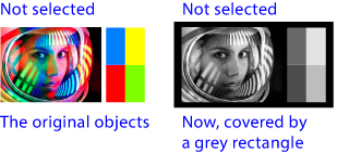
Look for colored areas
This method allows us to avoid the selection of images that have some coloured areas in specific zones.
It is based on checking if the "coloured" pixels do not accumulate in some areas. If this is not the case, the image is selected.
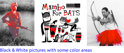
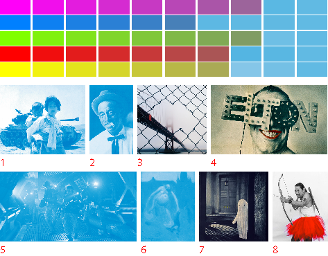
Some examples
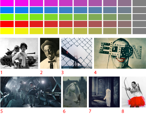
This is a PDF with several images and vector colour swatches. Below there are the results of applying different values (the selected objects are changed to blue).
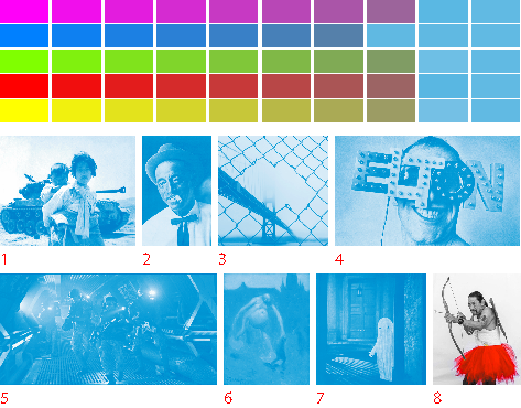
Tolerance "24", Images: "Calculate image average".
Tolerance "24", Images: "Look for colored areas".
[© Gustavo Sánchez Muñoz, 2026] Gustavo Sánchez Muñoz (also identified as Gusgsm) is the author of the content of this page. Its graphic and written content can be shared, copied and redistributed in whole or in part without the express permission of its author with the only condition that it cannot be used for directly commercial purposes (that is: It cannot be resold, but it can form part as reasonable quotations in commercial works) and the legal terms of any derivative works must be the same as those expressed in this statement. The citation of the source with reference to this site and its author is not mandatory, although it is always appreciated.